Anatomy of a Character
We know that brands are falling back in love with characters. Their effectiveness has been proven time and time again.
In D&AD's 2026 trend report released last month, the work that won was rule-breaking creative that only truly landed when the brand's personality already existed. Characters are making a comeback because they can't fake personality, so they make it visible, memorable and trustworthy.
Behind every character that makes a brand feel warm, familiar and human is a series of very deliberate design decisions. So, we asked a selection of our illustrators and directors to break down the design of their favourite characters.
Charlie Toqué on Polaroid
Polaroid wanted to create a character, their very first ambassador, based on the red button you find on all their cameras.
The character had to capture two big things about the brand. First, nostalgia: analogue photography and the brand's long history, which goes all the way back to the 1970s. And second, the beauty in imperfection, which is really at the heart of instant photography.
I've been using Polaroid cameras for as long as I can remember, so I already knew the brand well, and I knew what makes it feel unique and instantly recognisable. So I started by working on three different versions of this fun, charismatic little character, all inspired by the experimental animated films of the 1970s.
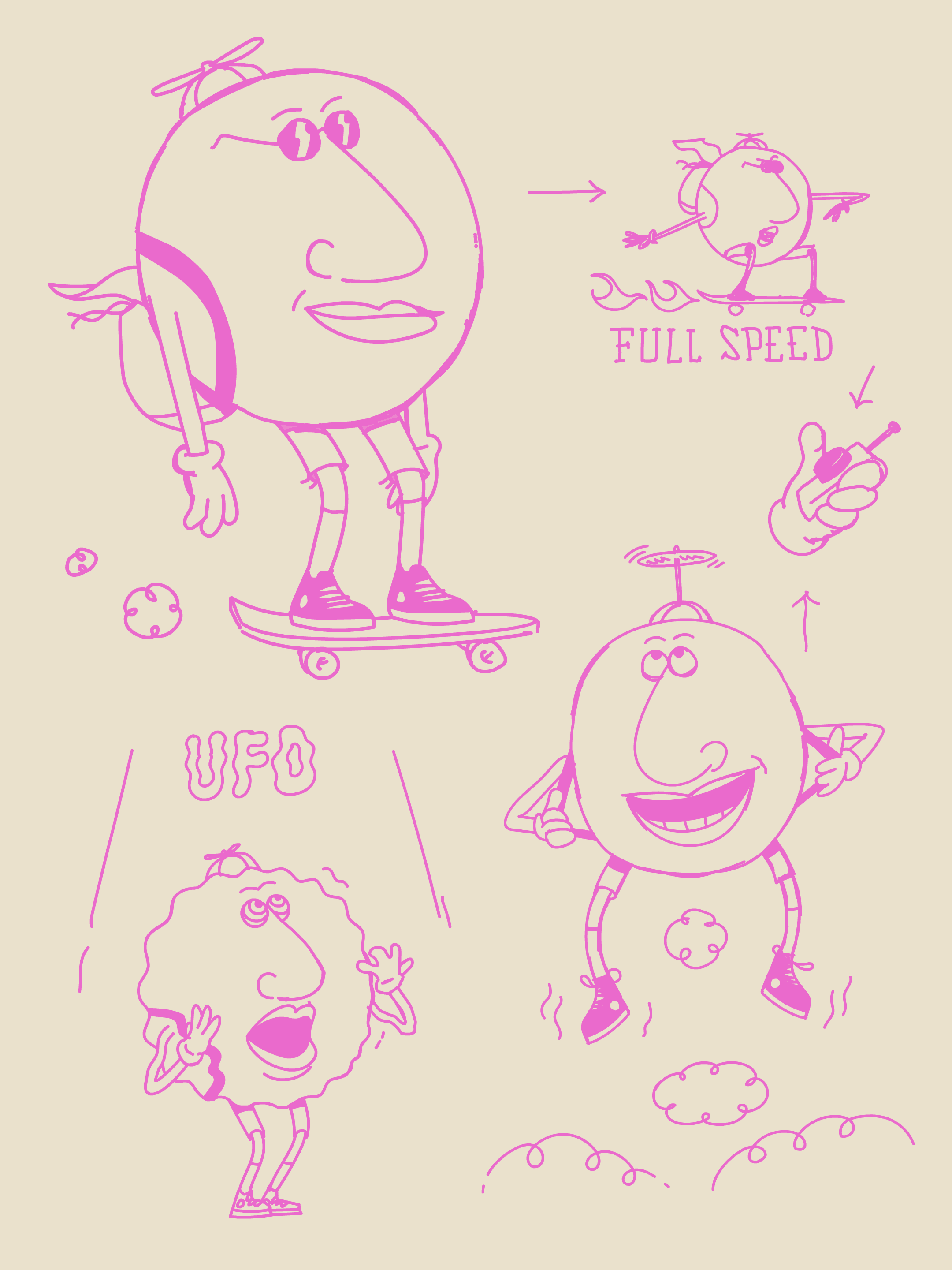
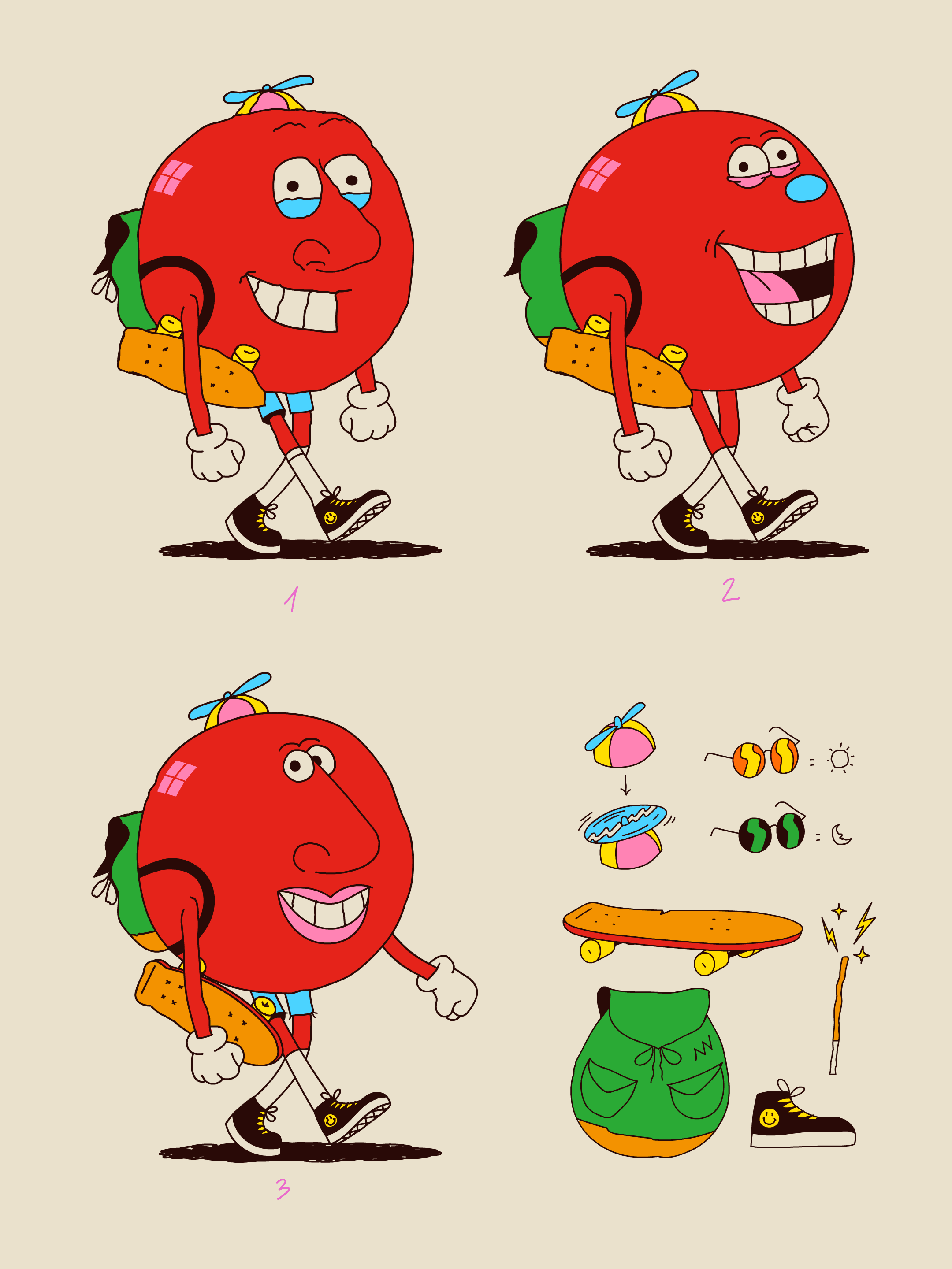
I didn't want to fake the accident that made the imperfection in the first place. That never really works. So instead I tried to loosen up the way I work, so I'd end up somewhere close to it naturally. I basically tried to get out of my own head and stop doing the things I always do. I drew with my weaker hand, on all sorts of different surfaces, and I used colours I wouldn't normally touch.
The skateboard and propellor hat allowed the character to move around the world quickly, while adding a cool and creative vibe - like the brand.
For the eyes, nose and mouth, I mixed my usual style with bits from lots of 70s character references. The big one was Sally Cruikshank's Quasi at the Quackadero, this mind-blowing, experimental, psychedelic short that I discovered while I was working on the film.
The whole idea was to get away from the polished, perfect character. Instead I looked for an unconventional balance in the face: small eyes, big nose, and how they sit in relation to each other. That gave me a character who's imperfect but still likeable, which ties back to one of the brand's mottos of finding the beauty in imperfection.
Once we'd landed on the right design for the character, I went back to a more classic approach for pre-production. Turnarounds, expressions and poses, lots of quick sketches. It let me see the character from every angle and really get a feel for who they are, and just take my time bringing them to life.